AstraZenecaPart 4 of 5
One prototyper, about ten engineering teams
AstraZeneca
About ten engineering teams rebuilt my prototypes in their own environments. Small changes kept coming back to me.
My decision
Give engineers a shared starting point, with clear rules for when a product pattern or the brand guide takes priority.
- The design change
- Tokens, components, and a standalone reference made the patterns available for other teams to build with.
- What happened
- One engineer reported package integration; another used the component reference. Wider adoption was not established.
- Role
- My contract title was Senior UI/UX Business Analyst; I also worked as a UX designer and AI engineer. I designed and built across compliance, internal products, forecasting and medical AI, with business owners and engineering teams.
Facts
- Engagement
- August 2025 to August 2026
- Contract title
- Senior UI/UX Business Analyst
- Business units
- US Oncology, then Global Medical Affairs from May 2026
- Released
- Risk register, March 2026. Spec by me, built by ECS.
- PinkPulse
- Working resource hub for the breast franchise; I designed its discovery and interface directions.
- AI Workbench
- Working Global Medical Affairs product; my interface and workflow prototypes shaped the shared experience.
- Worked with
- A Compliance business owner and reviewers, AstraZeneca's delivery team ECS in India, medical specialists, engineers and a leadership sponsor
Why a shared system was worth building
The bottleneck was me
Across the Workbench program I prototyped for about ten engineering teams. Each team rebuilt my screens in its own environment. When a button or a status label had to change, the request came back to me. One prototyper can't keep up with ten teams, and the engineers were the ones left waiting.
In July a platform lead asked for a UI library in its own repository. I treated the ask as a reuse problem. The components already existed. What engineers lacked was a standard way to pull them into their own builds. I scoped the first version to one pilot team and left new visual components and a low-code bridge out of scope.
The program's architecture proposal went further. It would have required every module joining the Workbench to use a shared UI package. The workshop that discussed it recorded no outcome, so I don't count that requirement as adopted.
One prototyper, many builds

See how I compared the tools
Compare the options before building
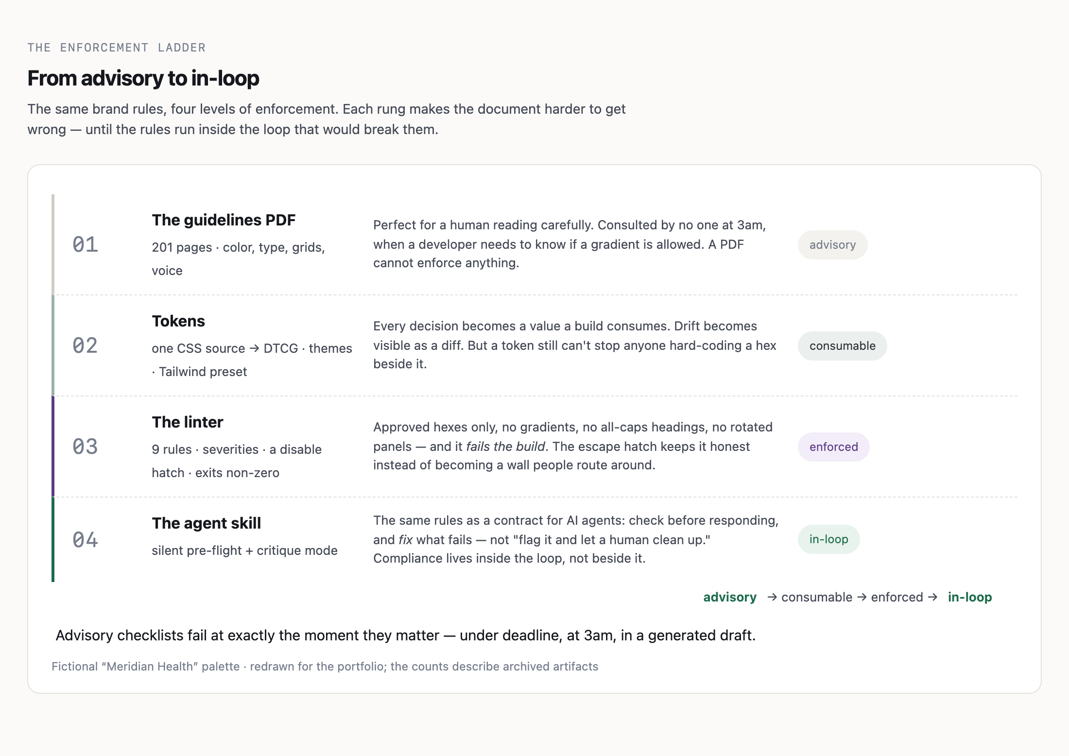
In February I wrote a research brief on keeping AI-generated work on brand. It compared five approaches we controlled and eight outside tools, grouped by how each one hands brand rules to an AI tool. Of the approaches we controlled, a live lookup against the design file was the most precise. Only developers could set it up, though, and by my own estimate it cost about 75 times more per page than a written brand instruction file read once. Most people generating screens weren't developers. I recommended written brand instructions for every output type, Figma Make for prototypes, and automated checks behind both. The system I built later followed that order: guidelines, then tokens, then a linter, then instructions for coding agents.
Scope
The cost and precision figures are my estimates from the brief, not measurements. I have no record of a formal decision on the recommendation.
The options, compared

Set the rules for trade-offs
The audit kept asking the same question
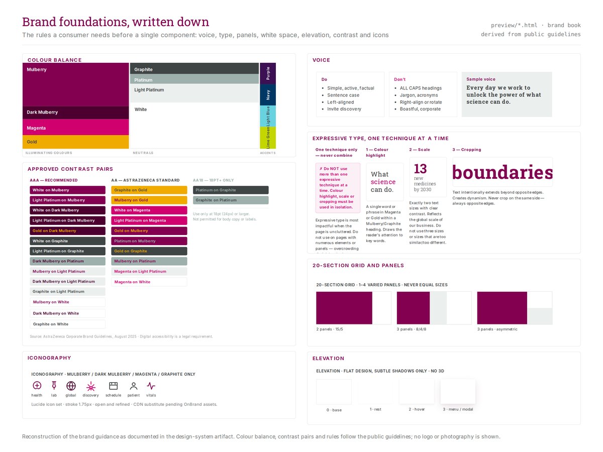
In May, a brand audit kept flagging tinted badges, uppercase labels, and color pairs the guide did not list. The product styles translated a print brand into dense software. The audit needed to distinguish a deliberate product pattern from a mistake.
I weighed three rules. Letting the guide win everywhere would turn each existing component into a pending exception. Splitting by audience did not help: most screens served both stakeholders and people doing the work.
Product code wins unless it's silent
On 20 May I set the default: where product code and the guide conflict, product code wins. Where the code says nothing, the guide wins. Reviews could stop reopening settled patterns and still catch real faults, such as colors from outside the palette.
Then tighten the rules that mattered
A default rule is where review starts. In July I reversed three things it had let through. Labels went back to sentence case. A gradient loading effect became a solid pulse. Every text size below 10 pixels moved up to a 10-pixel floor. Each change was small, and in each one the brand rule or legibility was right and the code was wrong.
The rule, on one card

Give engineers something to build on
The first app on the tokens was a regulated review
Before a speaker is paid to present, someone has to check their specialty and tier, because those set the fee. In April an engineer building a fair-market-value review tool asked me for a front end. The tool used an AI agent to classify a speaker's specialty and tier from their CV, and reviewers needed to see the evidence behind each call before a fee was set.
I built the front end on the shared tokens through a generated theme file, with no styles of its own. It ran as eight review steps from upload to recommendation, later grouped into four stages around the reviewer's decisions. I prepared the handoff: a written developer package and a verification script. The old prototype stayed as a reference only, and the app ran on one checked-in sample record. Connecting production data was the build team's next step.
Contribution
I built the front-end baseline and the handoff. Another engineer owned the build. The agent and the backend were other people's work.
Evidence before the decision

A reference by the next morning
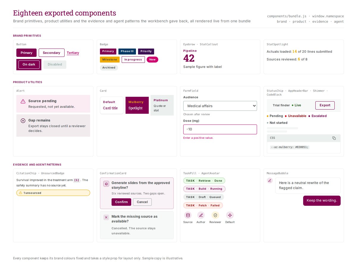
In early July engineers needed a component reference by the next morning so they could build their own workflow screens without asking me to adjust each element. I made a standalone HTML reference that opened directly and printed to PDF, with labels, states and style references beside each component.
On 2 July one engineer reported integrating my shared UI package into the budgeting work. Another confirmed receiving the reference and using it in his own environment. Backend connections were separate from this UI work.
What the system held at handover
In mid-July I merged three sources into one repository: the brand guideline extraction, the Workbench components and an older component bundle. It held 294 design tokens and 127 React components, 26 of them core controls such as buttons, fields and badges.
Brand rules ran as checks. A linter, a test that failed the build when generated tokens drifted from their source, and a documentation coverage check all ran in one verify command. Most people producing screens with AI tools would never read a guideline, so the checks had to catch drift for them.
The system kept a design-debt register, and a row closed on evidence, not a tick. Dark-theme colours stayed hand-maintained, so a test was added that fails when one drifts from its token, and a value was changed on purpose to prove the test caught it. Text smaller than a 10-pixel floor counted as a defect and moved up to it. At the last count 60 of the register's 65 rows were resolved. One open row noted that the verify command still ran no accessibility tests.
Inspect the shared reference
Decide who decides, then report what happened
One approver per decision, and a record of who was missing
I drafted a governance charter for the system. It gave every decision type one accountable approver. Committees could advise, but one role signed. The charter named eight roles. I was the only named holder, and I wrote that down as a staffing gap, not as proof the other roles were unnecessary.
Inspect the governance conflict and adoption timeline
Settle which rule governs before moving code
On 20 July I found two of the system's own documents pointing opposite ways. The promotion rule said Workbench code couldn't be bulk-copied into the shared package. Each component needed an owner, a token mapping, an accessibility review, documentation and evidence. An inventory written the next day recommended bulk-promoting the Workbench's data, state and deck code as top priority. The register's one open technical item, 502 type errors from code that was never copied, depended on which document won. I wrote the conflict down and set an order: settle which rule governs in a new decision record, define the package's public entry point, then fix the errors. I rated the missing entry point a bigger blocker for ten teams than the errors.
Scope
The reconciling record wasn't written before my work ended, so the question stayed open.
Adoption on record
February 2026
Options brief. A recommendation, with no build yet.
April 2026
The fair-market-value review app runs on the shared tokens. I prepare the handoff to its engineer.
20 May 2026
Product code wins unless it's silent.
2 July 2026
One engineer integrates the shared UI package. A second confirms using the component reference.
16 July 2026
A platform lead asks for a UI library. I scope one pilot team.
19 July 2026
I tighten three brand rules and redefine adoption as something the repository can count.
August 2026
I prepare two developer packages. No receipt is on record.
What engineers used, and what remains unknown
In July the adoption dashboard had nothing to read, because no analytics source sat behind it. I redefined adoption as something the repository could count: places in the code that used the shared tokens. The count was two, both inside the repository. I'd rather show that number than a funnel.
Outside the repository the record holds one app in April and two engineers in July. I have no usage data after July, and nothing on record shows the August packages arrived.
Check the file someone receives
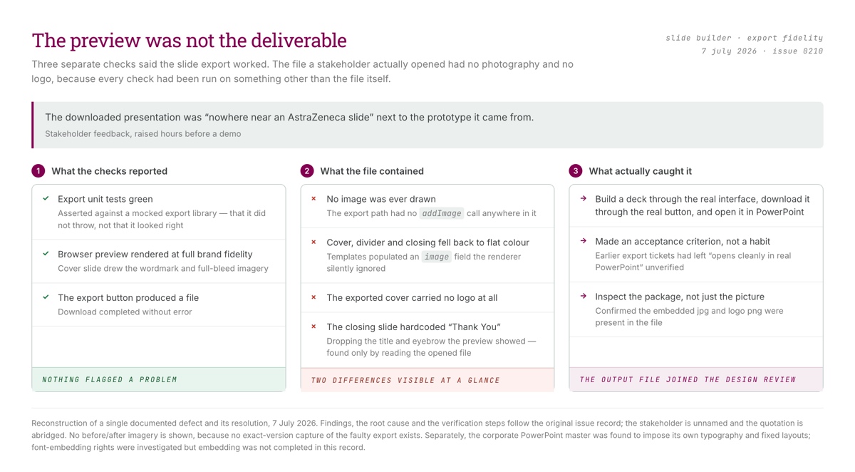
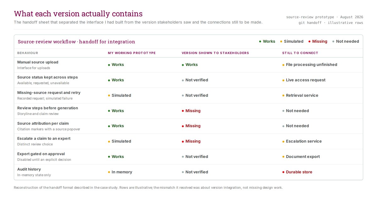
My July handoffs taught me to write down which behaviors worked, which were simulated, and which connections were missing. Stakeholders had seen a version without the source-review controls I had built, and we traced the gap to version integration. An export check taught the same lesson from the other side. Three checks passed while the downloaded slide file was missing its images and logo, because none of them opened the file.
Inspect the export check
Handoff details
Results
- In April a fair-market-value review app ran on the shared tokens, and I prepared its handoff to the engineer who owned the build.
- On 2 July one engineer reported integrating my shared UI package, and a second confirmed using the component reference.
- Brand conflicts had a default rule: product code wins unless it's silent. In July I tightened it where the brand guide or legibility was right.
- At handover the repository held 294 tokens and 127 React components, 26 of them core controls, with brand rules run as checks.
Evidence limit
Inside the repository, adoption counted two consumers, both internal. I have no usage data after July, nothing on record shows the August packages arrived, and accessibility conformance is unverified.